- HubSpot Community
- Resources
- Releases and Updates
- [Now Live] A Refreshed Design for HubSpot CRM
Releases and Updates
Im Forum
Releases and Updates
Vorschläge aktivieren
Mit der automatischen Vorschlagsfunktion können Sie Ihre Suchergebnisse eingrenzen, da während der Eingabe mögliche Treffer angezeigt werden.
Suchergebnisse werden angezeigt für
Optionen
- RSS-Feed abonnieren
- Als neu kennzeichnen
- Als gelesen kennzeichnen
- Lesezeichen
- Abonnieren
- Drucker-Anzeigeseite
- Anstößigen Inhalt melden
- RSS-Feed abonnieren
- Als neu kennzeichnen
- Als gelesen kennzeichnen
- Lesezeichen
- Abonnieren
- Drucker-Anzeigeseite
- Anstößigen Inhalt melden
Nov 22, 2016
4:54 PM
[Now Live] A Refreshed Design for HubSpot CRM
[12/20 Update: As of 12/19, refreshed design for HubSpot CRM is now live to all HubSpot CRM portals.]
HubSpot CRM is a designed to make organizing your interactions with leads and customers simple and straightforward. With that mission in mind, today, we're excited to announce that the CRM will undergo a modern facelift in the coming weeks aimed at bringing a new level of clarity, consistency, and joy to your routine. Rest assured --- the functionality you're used to won't be altered. The refresh will focus solely on the look and feel of HubSpot's apps.
In this article, we'll walk through the timeline of the changes and give you a quick tour of the new design.
Note: If you're not an active user of HubSpot CRM and saw this message above a contact record in your Marketing tool, click here for a preview of the contact record's updated look. This change will go into effect in December.
Overview
The changes will occur in two parts. First, when you log into your CRM this afternoon (11/22), you'll be greeted by a message asking if you'd like to try out your visually refreshed sales dashboard. When you click through, you'll see something like this:
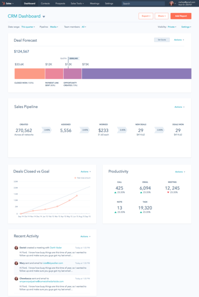
The updated dashboard will give you a taste of the visual refresh and a sense of what's to come in the rest of the tool.
In the refreshed dashboard, all the sales KPIs you’re used to are right where you left them --- your revenue forecast, deal pipeline, and rep productivity remain easily accessible. A few other things to get excited about, in the new interface:
- Brand new data. A new "deals closed vs. goal" graph that charts your team's performance over time, compared to your business's benchmarks.
- Customizable Layout - The new interface enables you to prioritize the sales metrics that are most important to your team. Resize and reorder the modules with a simple drag-and-drop.
- Easy Sharing - With a few clicks, enable your dashboard to be automatically dropped into your inbox at any frequency you desire.
- Quick Access to Your Other Dashboards - If you use HubSpot’s Reporting Add-on, seamlessly scroll between your Dashboards without any extra clicks.
- (Reporting Add-on users) Add any of your custom reports to your new sales dashboard with one click.
For the coming weeks, as you get used to the new look, you'll have the ability to toggle between the "old" and "new" dashboard designs using a button in the bottom-right corner of your new dashboard.
Then, in December, you'll gain access to the new design permanently --- in both your dashboard, and throughout the rest of the CRM as well. From that point forward, you'll have the new design across the CRM, and you won't be able to opt back to the current version.
What does does the new design look like?
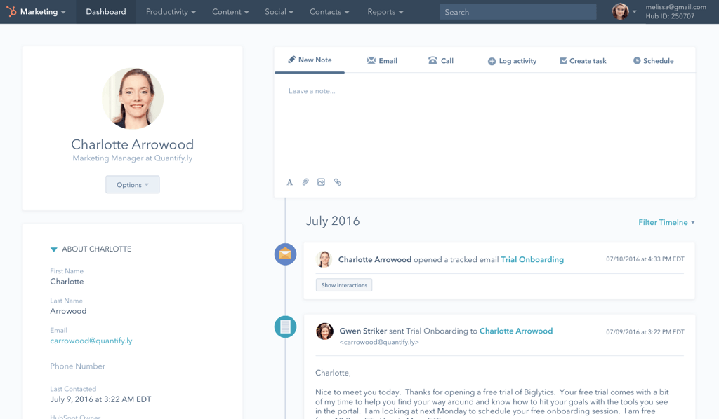
The new design looks simple, sleek, and modern. But don't take our word for it --- here's a sneak peek of a few of your most pivotal tools, refreshed with the new look. As we mentioned above, these refreshed screens will make their way into your portal in December.
Deal board:
Tasks: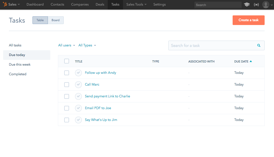
What's actually changing?
In total, we’ve made dozens of little tweaks across the platform. Chances are good that you won’t notice too many of them. Think of it like getting your car tuned up. You might not be sure exactly what changes were made, but you'll leave the lot with a much better car. All of the changes will blend seamlessly into your routine, and their sum total will make your experience using HubSpot simpler and more enjoyable.
Consistent Components
Details, details. With this refresh, we've updated all those "little things" not only to match in aesthetic, but also to align in function across the HubSpot tools -- filtering, date-picking, sub-navigation, and more.
Updated Fonts
We switched from Helvetica, a traditional and relatively neutral font, to the more approachable and readable Avenir.
New Colors
We’ve updated the color scheme to make it easier to identify next steps within a given part of the platform. Spoiler alert: There’s more orange.
Breathing Room
We’ve increased the amount of whitespace to make the tool more legible and easy to navigate.
For the full scoop on the redesign, read this.
To recap, you'll see the first sign of the visual refresh this afternoon (11/22): a message on your sales dashboard enabling you to check out the refreshed look.
Then, in December, those visual changes will make their way to the rest of the CRM.
Questions, comments, or concerns? Let us know in-app, using the feedback button on the new dashboard.
Neueste Artikel
- reCAPTCHA opt-out for Commerce Hub Checkout
- [Live] Try invoices without enrolling in Commerce Hub
- [Live] Collect payments locally through PADs (Canada) in Commerce Hub
- [Live] Collect payments through BACs (UK) on Commerce Hub
- March 2024 Release Notes
- [Live] Accept Partial Payments on Invoices
- [Live] Display Multiple Tax IDs on Invoices
- [Live] Commerce Hub Subscription Timeline Card
- [Live] Japanese Yen now available in Commerce Hub
- [Live] Commerce in the Global top-level navigation
Sie müssen ein registrierter Benutzer sein, um hier einen Kommentar hinzuzufügen. Wenn Sie sich bereits registriert haben, melden Sie sich bitte an. Wenn Sie sich noch nicht registriert haben, führen Sie bitte eine Registrierung durch und melden Sie sich an.