- Communauté HubSpot
- HubSpot Ideas
- Separate Data date range and Visualisation date range
HubSpot Ideas
- S'abonner au fil RSS
- Marquer comme nouveau
- Marquer comme lu
- Marquer
- S'abonner
- Page imprimable
- Signaler un contenu inapproprié
- Marquer comme lu
- Marquer comme nouveau
- Marque
- Surligner
- Imprimer
- Signaler un contenu inapproprié
Separate Data date range and Visualisation date range
Hi there,
Currently when you edit a report the only way to create a date range is by adding it as a filter on the data. This is fairly limiting as it doesn't give you the flexibility of the visualisation.
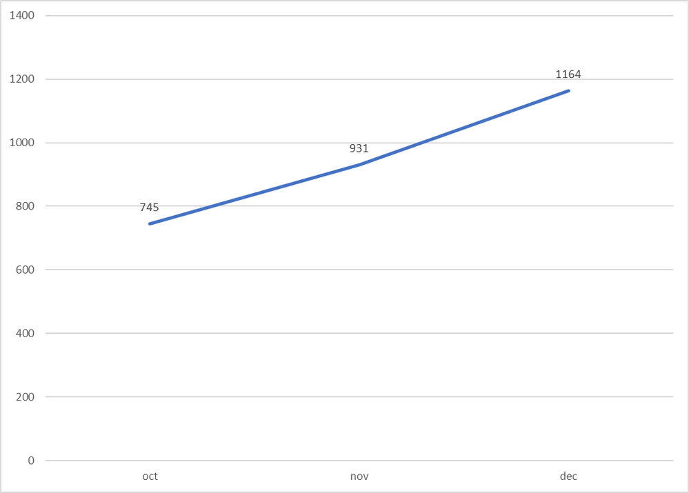
As an example, If I had a year's worth of data looking like the graph attached.

And I would like to have the same graph just focusing on the last 90 days, shown below.

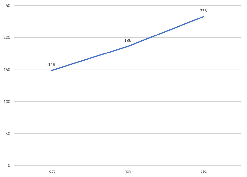
However, Hubspot seems to move the dates for the data as well as the dates for the visualisation together, shown in here.

See how the data values have changed as the 'count' has started from the new date. This example isn't too bad because the year-long visualisation works well, but imagine if you had 10 years of data! That graph would be unreadable when really you are only interested in the tail end.
There should be a way to separate the data date range and the visualisation date range.
Thank you
Tom