- Comunidade da HubSpot
- HubSpot Developers
- CMS Development
- iPhone Responsive Design Reformats Text in a Table
CMS Development
- Inscrever-se no RSS Feed
- Marcar tópico como novo
- Marcar tópico como lido
- Flutuar este Tópico do usuário atual
- Favorito
- Inscrever-se
- Emudecer
- Página amigável para impressora
jan 11, 2017 10:42 PM
iPhone Responsive Design Reformats Text in a Table
resolverHello,
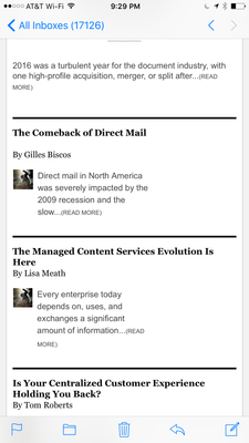
I'm having trouble controlling the iPhone reformatting of text in a table. For some reason, the text is only taking up half of the space when I veiw on the iPhone 6 Plus. In the preview function in Hubspot, the reformatting looks fine. Is there some code I need to add in the table?

File can be found here:https://www.dropbox.com/s/5lb66fp6cbbr32b/Outlook_MessageSource_2017-01-12%2003%3A30%3A05%20%2B0000_...
Solucionado! Ir para Solução.
- Marcar como novo
- Favorito
- Inscrever-se
- Emudecer
- Inscrever-se no RSS Feed
- Realçar
- Imprimir
- Relatar conteúdo como inapropriado
jan 13, 2017 10:38 AM
iPhone Responsive Design Reformats Text in a Table
resolver@rbeditor yes, media queries reference the size of the screen and do not take into account device types, so they will function for Androids and iPhones alike.
I'm not sure which border you're referring to, could you clarify? It is important to note that emails will often look different in Outlook, as the service renders code in an entirely different way from most email clients. You can read more in this article: https://knowledge.hubspot.com/articles/kcs_article/email/why-do-emails-look-different-in-outlook
Best,
May
- Marcar como novo
- Favorito
- Inscrever-se
- Emudecer
- Inscrever-se no RSS Feed
- Realçar
- Imprimir
- Relatar conteúdo como inapropriado
jan 12, 2017 1:19 PM
iPhone Responsive Design Reformats Text in a Table
resolverHi @rbeditor,
I'm not seeing much in the attached file - would you mind specifying whether the email in question is using a custom HTML template or a HubSpot template, whether you have set to it be responsive in HubSpot, and also the internal name of the email so that I can look at it in your portal? Thanks!
Best,
May
- Marcar como novo
- Favorito
- Inscrever-se
- Emudecer
- Inscrever-se no RSS Feed
- Realçar
- Imprimir
- Relatar conteúdo como inapropriado
jan 12, 2017 1:23 PM
iPhone Responsive Design Reformats Text in a Table
resolverI started with with a Hubspot template, but then made custom changes to it, using code to file and adding modules. Yes, i orginally used a hubspot responsive design before I made custom changes to it. The internal file name is: DOC_TOC_Template_Winter_2017_New_LinkCSS.html
- Marcar como novo
- Favorito
- Inscrever-se
- Emudecer
- Inscrever-se no RSS Feed
- Realçar
- Imprimir
- Relatar conteúdo como inapropriado
jan 12, 2017 3:16 PM
iPhone Responsive Design Reformats Text in a Table
resolver
I was able to find what was causing the text from not filling out its tables, but you might need to play around with the template some more in order to resolve the issue.
The text in your tables was being contrained by two fixed widths that are repeated throughout the template. For instance, on l. 544-550:
<table style="height: 30px;" width="230"> <tbody> <tr> <td style="width: 35px;" valign="top"><img style="max-width: 50px;" src="https://cdn2.hubspot.net/hubfs/2621416/DOC/Bud_50x50.jpg" alt="Bud_50x50.jpg" width="50" height="50" class="" align="left"></td> <td style="width: 0px;"> </td> <td style="width: 195px; text-align: justified;"><span style="font-family: arial, helvetica, sans-serif; font-size: 14px;">While the notion of "digital transformation" is not new, it is still misunderstood...</span><span style="font-family: arial, helvetica, sans-serif; font-size: 10px;">(READ MORE)</span></td> </tr>
If we change the width="230" and width: 195px;, this will allow the text to fill out more. I changed both widths to 400px with the Chrome developer tools here:
If you add elements to your @media only screen and (max-width: 480px) media query on l. 269, changing table and td widths to 400px or similar, you should be able to improve the responsiveness of this text.
In general, though, I would not recommend cloning email templates to file unless you are comfortable with making significant design and mobile responsiveness changes, as the option to automatically make your template responsive is only available on drag-and-drop templates and will not appear if you are working with a custom HTML template.
Let me know if you have any clarifying questions!
Best,
May
- Marcar como novo
- Favorito
- Inscrever-se
- Emudecer
- Inscrever-se no RSS Feed
- Realçar
- Imprimir
- Relatar conteúdo como inapropriado
jan 13, 2017 9:22 AM
iPhone Responsive Design Reformats Text in a Table
resolverThanks! That makes sense. So if I add to the @media only screen wondering if this will affect all moble OS, like android?
One last thing. In Outlook, there is a black border around my header. How can I get rid of that in the drag and drop tempate?
- Marcar como novo
- Favorito
- Inscrever-se
- Emudecer
- Inscrever-se no RSS Feed
- Realçar
- Imprimir
- Relatar conteúdo como inapropriado
jan 13, 2017 10:38 AM
iPhone Responsive Design Reformats Text in a Table
resolver@rbeditor yes, media queries reference the size of the screen and do not take into account device types, so they will function for Androids and iPhones alike.
I'm not sure which border you're referring to, could you clarify? It is important to note that emails will often look different in Outlook, as the service renders code in an entirely different way from most email clients. You can read more in this article: https://knowledge.hubspot.com/articles/kcs_article/email/why-do-emails-look-different-in-outlook
Best,
May
- Marcar como novo
- Favorito
- Inscrever-se
- Emudecer
- Inscrever-se no RSS Feed
- Realçar
- Imprimir
- Relatar conteúdo como inapropriado
